Spotify’s New Logo Sparked Outrage Across the Internet
A bad AI logo became their most effective marketing campaign.
House Special
/


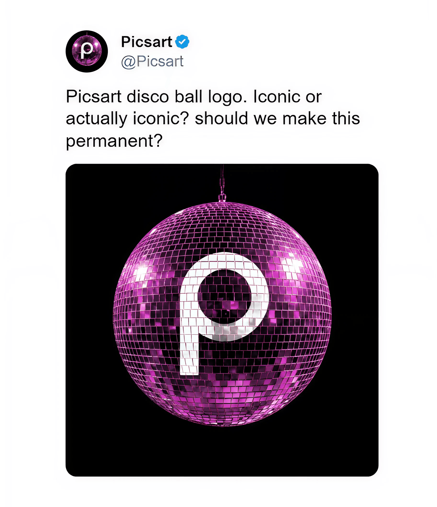
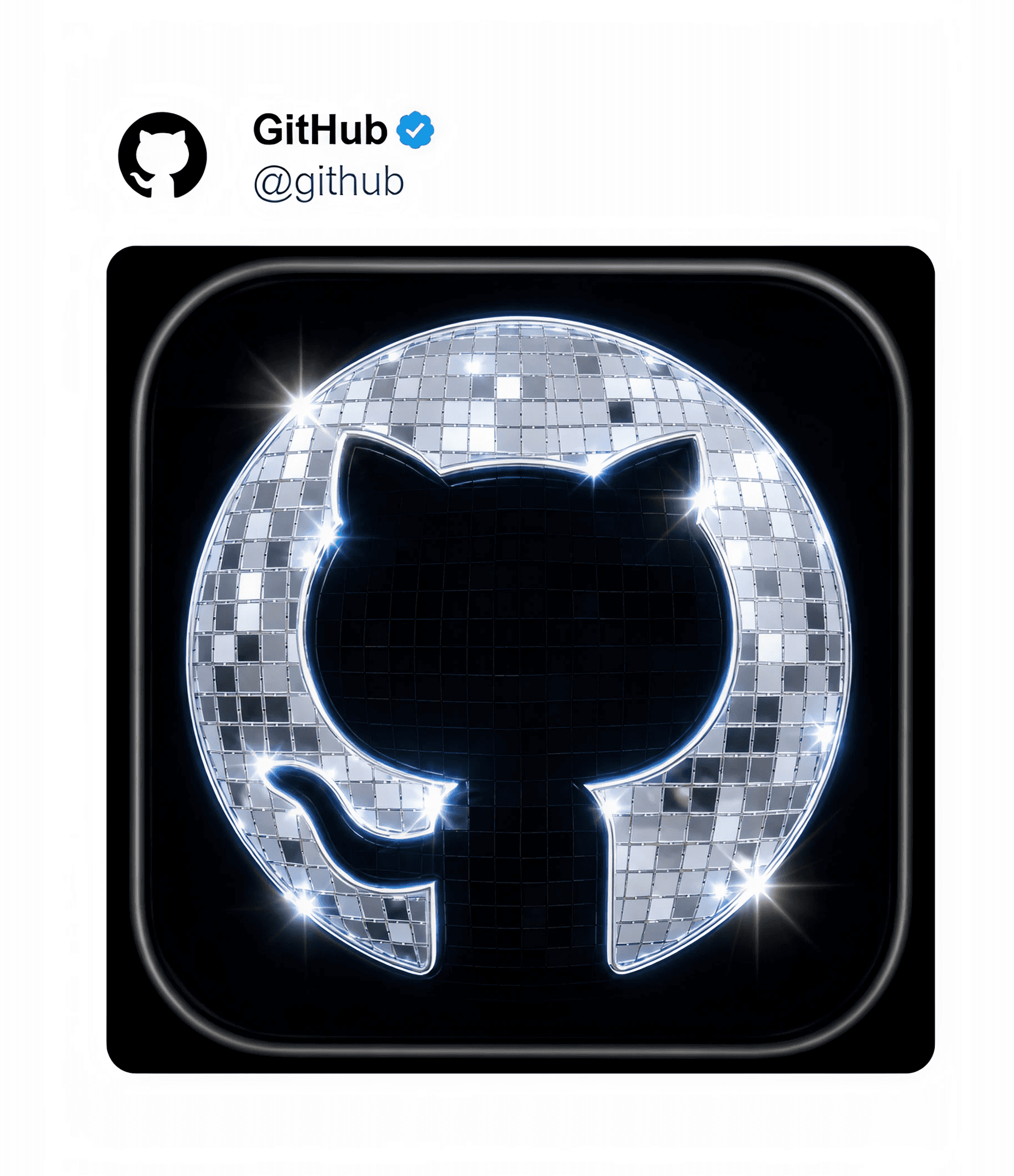
To celebrate its 20th anniversary, Spotify temporarily replaced its logo with a green disco-ball version of its icon.
The redesign was immediately mocked online; users called it ugly, cheap, and AI-generated. Others began posting AI recreations of the logo across social media to make fun of it.
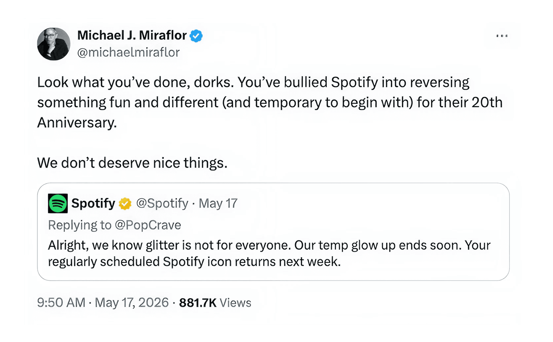
Spotify responded on X, confirming the redesign was temporary and would be reverted the following week.
Branding on the internet is subtly changing.
Tech companies for decades opted for minimalism. This became the dominant aesthetic because every platform wanted to appear elegant and frictionless.
Google’s branding has been pointed out as sterile and devoid of personality for years. Once every brand embraced minimalism, the design stopped creating recognition.
Spotify’s redesign interrupted the visual monotony and forced people to react.
The backlash became brand marketing for them. Users and companies everywhere generated memes, parody logos, and AI recreations of the design without Spotify having to buy a single ad.


The internet trains brands to optimize for polish and “good design.” Feeds are now so visually sterilized that the brands creating the most recognition today are loud or slightly uncomfortable.
On LinkedIn, designers are criticizing Spotify’s creative team. On Instagram, users are petitioning the company to keep the logo permanently.
What would be considered bad taste ten years ago now functions as differentiation. The redesign didn’t just spark conversation around Spotify. It started a larger argument about what good design even means anymore.
In the digital era, being unmistakable may matter more than being tasteful.

With every brand trying to appear timeless, distinctiveness starts to matter more than taste.
Will you choose branding that feels correct, or branding that people can’t stop talking about?